
The Importance of Design Research
I’ve just returned from a visit to a lodge with the intention of completing the renovation. When it comes to looking at design, I am quite open-minded and appreciate good quality design when I see it. However, when I see designers using completely wrong things in settings, I am extremely irritated.
Here’s an illustration of what I mean. A timber veneer floorboard has been installed in a high-traffic cafe setting. As a result of the high foot traffic, it has become discolored and cannot be sanded back and refinished like solid timber floorboards, and in order to replace it with timber floorboards, the timber would need to be allowed to acclimatize in the space for at least a month before it could be laid down. The fact that the business must continue to operate ensures that this will not be successful. That was the first and most serious error.
The use of paper wallpaper in the restrooms is the second blunder to make. Even if it has a beautiful design, image what it looks like around the wet places; there is essentially no paper there anymore, and where horizontal surfaces are cleaned on a regular basis, such as basins and shelves, the surrounding wallpaper has rubbed off. A few spots have enormous gauges coming out of them, and the wallpaper does not provide any protection for the walls. Clearly, this was not an appropriate finish for a commercial restroom.
As a result, my lesson for today is the significance of research in the design process. It is critical that you are familiar with the products you are specifying. While no finish will endure indefinitely, we can ensure that we get the most out of them and that the interior remains in good condition for as long as possible, which is especially important in commercial environments.
Don’t be taken in by something that appears to be attractive! Get your hands dirty and find out all about its features and characteristics. If the company can provide you with a location where it has been installed, you could go and have a look to see how it has changed over time, or you might ask for testimonials from some of their customers.
Over time, you will learn which things are of high quality and which products you should avoid, but in the meanwhile, you must thoroughly investigate each item you intend to use in your design and ensure that it is appropriate.
Nothing has to be of the highest quality and most expensive; sometimes we have projects that are intended to be completed in a short period of time, and you can use good-looking but low-budget materials and finishes because that is what the client brief requires; however if you need something that will last more than five years, you should read the fine print carefully!
I hope this serves as a reminder for you the next time you come across the latest and greatest design product. It is not enough to simply get on the bandwagon because it is brand new; you need also to test drive it!
A color scheme in a room should have a maximum of how many colors it contains.
This is a frequently asked question about interior color from our readers. As a result, I thought I’d share some of my thoughts with you.
My standard response is that there are no hard and fast laws (here it is), but having more than five in a single place will make your decor appear cluttered and unappealing to the eye.
There is no such thing as a modest color accent in a sofa fabric, nor are there any ten distinct shades of green on a landscape picture on the wall, that I consider being a color. I’m referring to about five broad sections of varying colors in a row.
Because of the style, there are around five significant amounts of color in this shot; any more colors would be considered excessive; any more colors would be considered excessive.
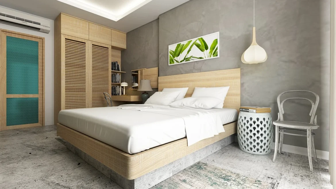
Does it really need to be said that the fabric alone in this tropical bedroom has more than five different colors?
Using five or more hues, as well as texture and pattern, is recommended.
Although there are more than five colors in this mix of fabric patterns, they are kept in harmony by the use of texture, pattern, and the subdued tones of the hues.
I’ve shown you some examples of design that incorporate more than five colors, and I’ve gone through my huge database of photographs to find that the majority of interiors employ less than five colors. In fact, the most popular color combination would be the employment of two colors and a neutral, such as the one seen in the image below. Oh, and I almost forgot to note that the neutrals, which include black, grey, and white, as well as variations of these colors, do not count as colors.
I hope this has sparked your interest in color and how to use it effectively. Begin by taking a glance around you and counting how many different colors are employed in a single place. What appears to be more or less attractive? If a room is furnished in a specific style or time, does it make any difference what that style or period is? What’s most important is to pay attention to how the color combinations affect you. I know that sounds a little strange, but different colors elicit different emotions in different people. Remember how this works, whether it’s a good or bad thing, and start experimenting with it on your own designs.